Create some colorful window art with this simple method! You can hang your creations in a window or make them into a mobile! You can also use your colorful translucent wax papers for scrap booking and collage projects!
What you need:
Wax Paper
Crayons – with papers peeled.
Iron
Newspaper
String
Hole punch
Handheld pencil sharpener or Crayon sharpener
Scissors
Stencils, templates, or cookie cutters to trace for your shapes!
Pencil
Step one: Cover your work surface with newspaper and lay a piece of wax paper on top!
Step two: Using your hand held sharpener, sharpen your crayons over your wax paper. We want all the little shavings from the crayons on your wax paper! Keep in mind your crayon colors will get mixed together in our next steps!
Step three: Once you have quite a bit of crayon shavings covering your wax paper, lay another piece of wax paper on top and cover with more newspaper.
Step four: Carefully iron your wax paper to melt all those crayon shavings between your wax papers!
Step five: Let your paper cool off slightly and then remove the newspapers. Check out your awesome piece of translucent wax paper!
Step six: Use a stencil, template, or cookie cutter to trace a shape on your wax paper with a pencil. I made a fish template that I cut out of some card stock.
Step seven: Cut out your shapes, make a hole and add your string!
Step eight: You can hang your cut outs in a window just as they are or you can add them to a dowel or hoop (like an embroidery hoop) and create a mobile!
These colorful wax papers are also fun to use in scrap booking or collage projects too!
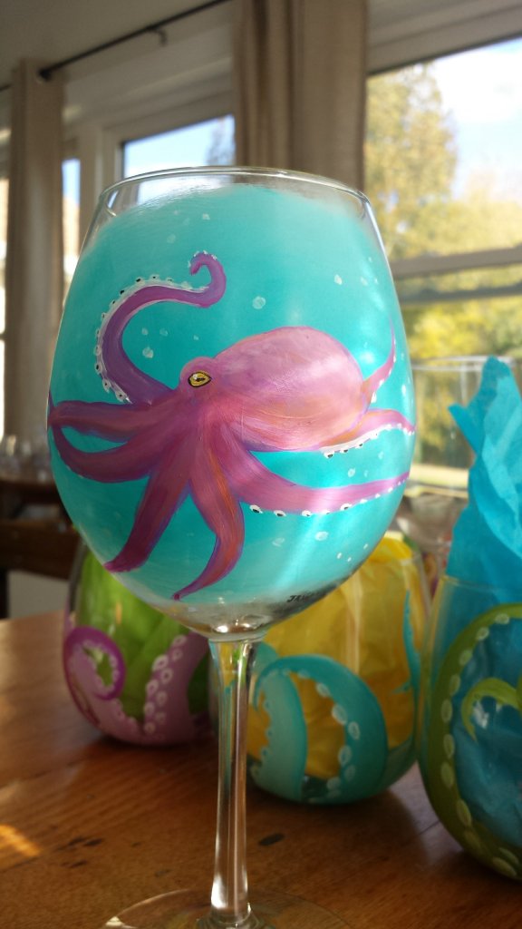
Hand painted wine glasses are a fun break for me from more traditional drawing and painting projects and commissions! These little paintings don’t often take more than an hour or two to complete and make a fun gift!
I use Martha Stewart Multi-surface craft paint for all my painted wine glasses. I find it holds up well and I like the Satin finish on the glass to give some contrast. I first clean the glass surface with rubbing alcohol. And then begin to paint!
Most of the time I apply more than one layer of the paint to the glass – some colors need more layers than others to make them more opaque. I let each layer dry before applying the next….so often times I work on multiple glasses at a time. Any mistakes can be easily cleaned up with a little rubbing alcohol on a paper towel or q-tip 🙂
After layering, I add the final details with a tiny round brush – sometimes I find I need to add a little water to thin out the paint for this step. Then, to cure the paint on the glass, it needs to set out for 21 days, or be baked in an oven at 350*F for 30 min.
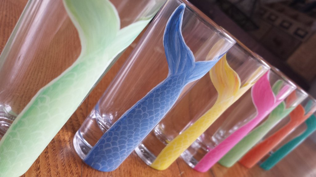
Besides wine glasses, I’ve also use glass mugs, beer steins & shot glasses. For me these are something a little different to get creative with and they also make a fun paint night project & class! 🙂
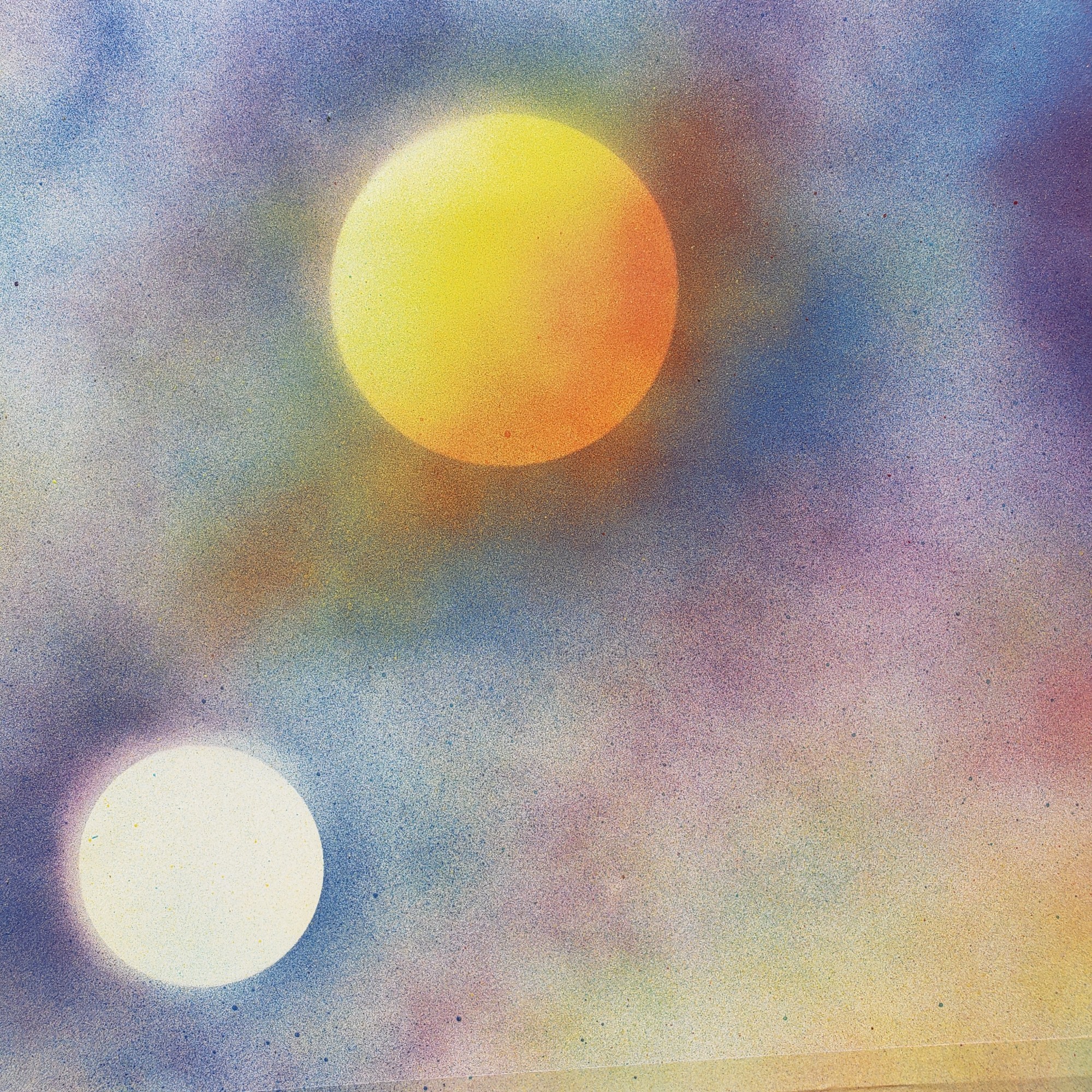
Create these awesome galaxy paintings just with some spray paint!
What you need:
Poster board (cut to your desired size)
Masking tape
Round lids from containers/jars, plastic bowls – These will get spray painted!
Plastic bag
Disposable gloves
Spray paint in various colors – I used yellow, blue, red, purple, black and white.
Step one: Make sure you have a work space set up outside – Spray paint travels, make sure you have a lot of space away from everything! You will need tape your poster board down, Glossy side up! I used a piece of plywood to tape mine to, cardboard would work as well! The tape will hold your paper flat and still as we work and also create a white border on you paintings!
Step two: Add a little color to your poster board with some of your spray paint. I used yellow and blue (we still want to see some of your paper).
Step three: Place some of your lids/bowls on your slightly colored poster board. These will become our planets and moons! Then spray your paper with some of your colors – it doesn’t need to be super dark yet, however, we can cover most of the white! Once you have it colored then remove your lids!
Step four: Spray paint your planets & moons! I like to keep one side of my planets lighter and make one side darker – this makes them look more like a sphere!
Step five: You can also create texture on your planets or moons by layering some colors quickly, then crinkle your plastic bag up and press it into the still wet spray paint. Immediately remove the plastic carefully.
Step six: Once you have your planets complete, cover them back up with your lids and bowls. Now spray your paper with black! Add other colors too to create nebula! I used blues, purple & pink! Overall we want your paper to be fully colored and on the darker side!
Step seven: When you’re happy with your background we’ll add stars! Make sure you have gloves on for this part! With your white spray paint, spray some paint onto your gloved finger tips – flick the paint onto your painting! Keep adding more until you have enough stars! Let your painting dry!
Step eight: When your paint has dried, remove the lids/bowls to reveal your planets and carefully remove your tape!
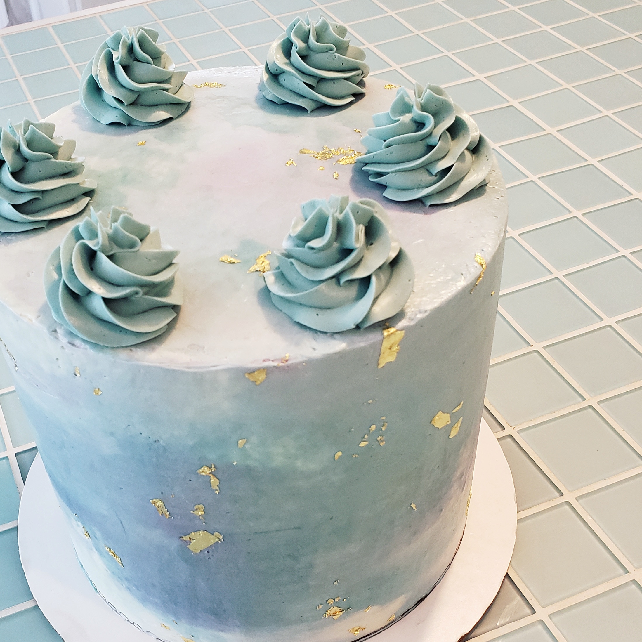
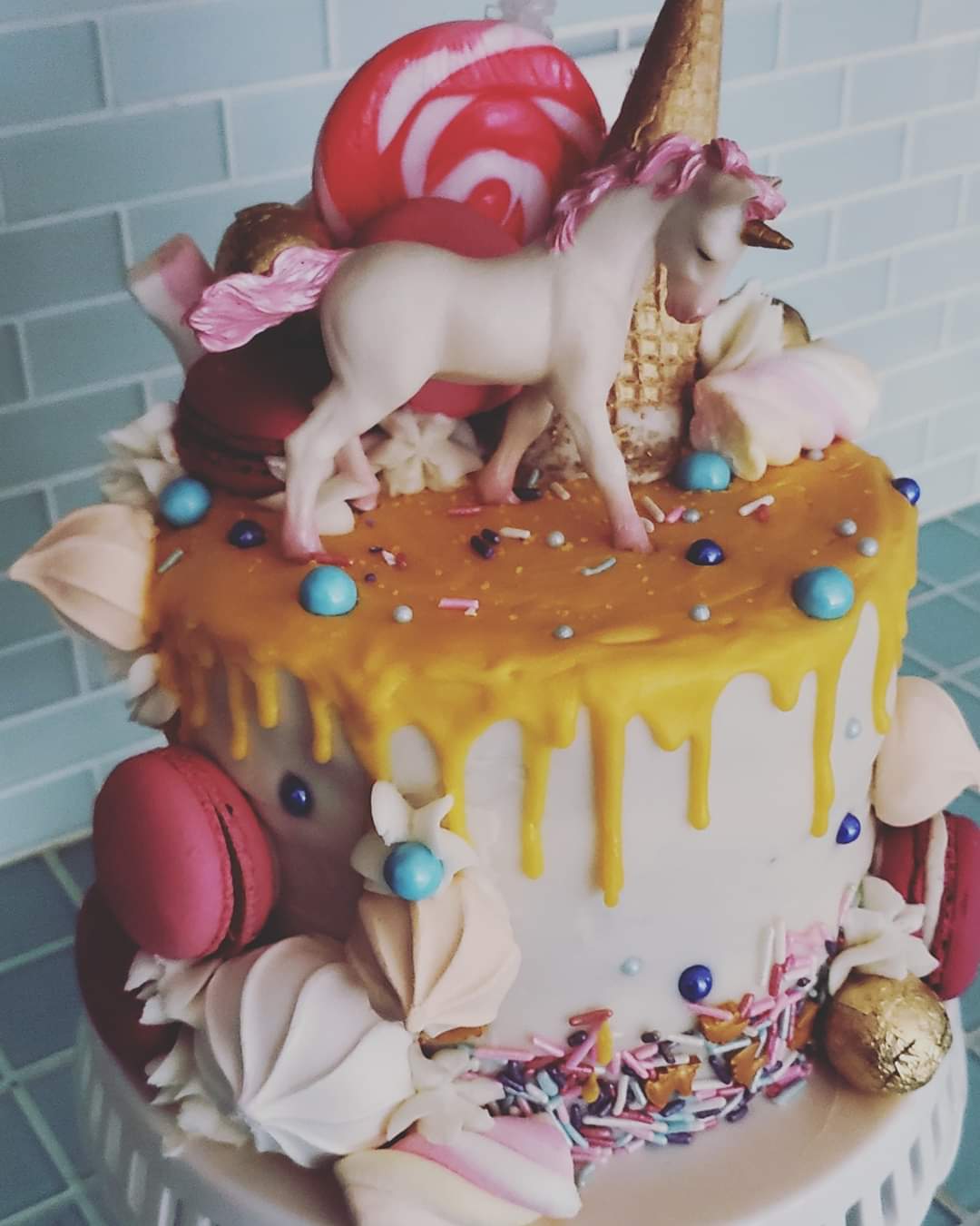
Most of you know I’m into art, some of you know I’m into food……if I can mix the two together – I will 😉 I enjoy cooking and making meals but I like baking most, and especially have fun with cake making. Specialty birthday cakes have always been a thing in my family and I can remember getting an awesome cake each year on my birthday as a kid. We’ve kept the cakes going…..and luckily I have decently sized family so there’s a fair amount of cakes to be made every year for birthdays and gatherings! My siblings also get in on the action to help with the cake creations so these cakes are definitely a collaborative effort – and it’s always nice to be able to get creative with them!
Most of our cake endeavors are purely trial and error mixed with a bit of research. And there have definitely been some cake fails over the years but they’ve only made us more creative with “cover ups”!
We use cake central a lot for recipes and tutorials, my favorite, quick, recipe for cake building and stacking is the original WASC cake. It’s easy, delicious, dense enough to carve, and it’s simple to make various flavors. This is typically the buttercream I use but it varies depending on what it’s being used for!
We “cheat” and use pre-packaged fondant & gum paste! – Fondant is what we’ve used to cover our cakes and create some of the sculptures with. Most fondant sculptures require an armature of some sort to support the fondant, while it does firm up some after setting out, larger pieces need some sort of support to keep it’s shape, and sometimes even with that we run into issues – humidity doesn’t help! For smaller, more delicate decorations, we use gum paste. You can make this paper thin to create flowers, cover armatures, and make toppers. The gum paste will dry out and become hard much faster than the fondant. Wilton brand is what what we use for both. Their fondant comes in large blocks of white and you can create your own colors or they have smaller blocks of various colors! The gum paste comes in a smaller tub of white and we mix our own colors. You can use regular food coloring but gel coloring works best! We use corn starch to keep our fondant and gum paste from sticking and a very small amount of water applied with a paint brush to stick pieces together.
Gumpaste Flowers
Buttercream covered cake with fondant decorations
Gumpaste flowers with petal dust coloring
Some additional cakes that use fondant…….
Armatures are created out of rice crispy treats or tin foil – depending on how edible we want our cake to be! As well as tooth picks, skewers, dowels, foam, & wires have all been used to make some of our armatures. Smaller creations don’t really need an armature but it’s nice to have a toothpick or dowel on toppers to make them easy to attach!
This guy was made from rice crispy treats and covered with fondant
For this cake we used a piece of plywood as the base and attached a length of wire covered with tin foil and fondant create the gravity defying effect!
Recently we’ve upgraded with an airbrush for some of our coloring techniques but for the longest time we used Wilton color mist and still do for some projects 🙂 We also use gel colors and petal dust for some of our decorations.
Gel coloring painted on a gumpaste cutout Airbrushed background with buttercream succulents!
Decorating or using candies and other food for cakes is also a fun way to get creative – the one below was inspired by Roy Lichtenstein’s pop art style that uses Benday dots and is an easy one to try at home – frost a sheet cake with white or light colored frosting. Create an outline of what you’d like to be on your cake with black string licorice, black fondant, or black frosting……since this style represents comic book art, some simple ideas would be a thought bubble, a word (like “ZAP”, “POW”, etc. in bubble letter form, or inside a thought bubble). This was a cake for my sister, so we did a portrait of her – comic book style 😉 Then use m&m’s and/or skittles to to create the Benday dots. You can see some areas where we had to cut the m&ms in half to fill smaller spots!
Cookies, cupcakes, and gingerbread – or really any desserts are just as fun too!! 🙂
In any case, definitely play with your food and turn it into a work of art 😉
One point perspective lettering is a fun and easy way to get started with perspective drawing and an element you can apply to other works of art! Check out the instructions and video below to create your own one point perspective words!
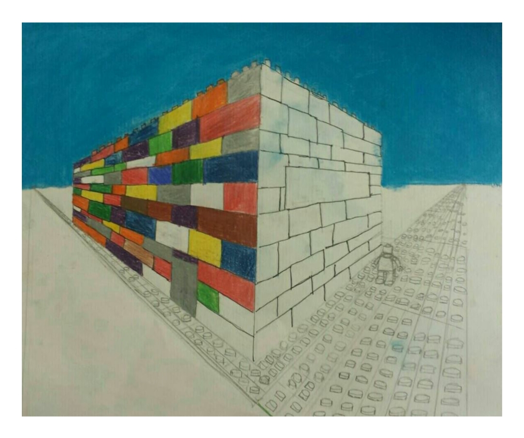
What is perspective drawing? When we look at something we see things a little differently then how they actually are – for example, we know that the edges of a road are parallel, but if we’re looking down the road, the edges seem to eventually come together and vanish at a certain point in the distance, making the road appear to get smaller and smaller the further away it gets. The same can be said if you look at houses lined up on a street – the house you’re closest to appears to be largest and the houses way out in the distance appear to be smaller, even though if you were to walk up to the houses in the distance, they would actually be the same size as the house that you’re closest to now! So in artwork when we want to achieve a realistic or dimensional look, if we’re able to create the appearance of what we see, rather than what we know, we can make a more convincing piece of art.
We know the edges of a road are parallel….
but when we look down a road, the edges seem to meet and disappear at a vanishing point in the distance.
VANISHING POINT: The vanishing point is that point in the distance where, in the example above, the edges of the road seem to disappear. In one point perspective drawing we only have one vanishing point – so we’re drawing objects or scenes directly from the front, or their true shape. For example (in the photos below) a cube with one point perspective will show a square at the front, whereas two point perspective will show the cube with the corner edge closest to you, making us able to see two sides of the cube, which each require their own vanishing point far off in the distance.
One Point Perspective
Two Point Perspective
EYE LEVEL LINE: We also use an eye level line (or horizon line) in perspective drawing. The eye level line is the height where your eye level is – we can determine if objects in your drawing are at eye level, above eye level, or below eye level, simply by drawing your objects on the eye level line, above or below the eye level line.
We can see the top of the bottom box because it’s below our eye level line. The box at eye level we can’t see the top or bottom of, only the side. And the top box we can see the bottom of but not the top because it’s above our eye level line – we have to look up at it!
Once you understand one point perspective it’s a lot easier to understand two point and multiple point perspective drawing!
In the video below I use one point perspective to make a word look 3D. You could also do your name or initials or apply the same method to geometric shapes! This is also only one way one point perspective can be used – you can also use one point perspective to create a landscape and other works of art too!
Ideas & Tips:
You can be more precise and measure out the area where your letters will be placed so they’re even in size!
If you have a longer word or your letters are closer together – Start with the letter that’s closest to the vanishing point when drawing the lines from the letter back to the vanishing point. Then work out from that letter. Letters that are closer together will often overlap when drawing the lines to the vanishing point. (For example the ‘E’ in ‘DREAM’ below overlaps the ‘R’ and the ‘R’ overlaps the ‘D’).
Try changing where your eye level line and/or vanishing point are on your paper to create different angels.
Stagger your letters so you have some at, above, and below, eye level!
Instead of letters you can try the same method with geometric shapes.
Some Student examples of one & two point perspective drawing!
Morning Dove – PanPastel & pastel pencils, (7″x14″)
I received my first set of pastels when I was 10 – I don’t think I loved them quite so much at first, but now pastels are one of my absolute favorite mediums! They are what I use for most of my commission pieces and the medium I’m most likely to use for any of my own projects.
Pastels are created with pigment and a binder compressed into sticks – depending on how much binder is mixed with the pigment you get a harder or softer pastel. When I first started with pastels, and up until a few years ago, Prismacolor Nupastels were the only thing I used. These pastel sticks contain a higher amount of binder, making them a harder type of pastel – this allows me to achieve more details in my work than what I could with a softer pastel. These are also the pastels I use to teach with.
One of my earlier pastel pieces (2006?) completed with Nupastel on Canson Mi-teintes
I still use Nupastels in my pastel work but I also have a few other pastel mediums I like to use now too! For smaller detailed areas and textures I love Stabilo CarbOthello pastel pencils . They come in a wide range of colors and are a similar hardness to the Nupastels.
In the past couple years I’ve also started using PanPastels which are extra soft pressed pastels powders in a pan/cake form and are applied to your surface with soft sponge. I love how rich and smooth these go on! For the most part I use these in my backgrounds and base layers for larger areas and then add finishing details with the pastel pencils on top.
I also have used Sennelier extra soft pastels on occasion – I do enjoy them, however, they can be quite costly!
“Tux & Tsuki” – Completed with Sennelier soft pastels
The surface is probably the most important element though! I started to use Pastelmat a few years ago, it’s surface is velvety and does an amazing job of taking on layers upon layers of pastels. It also comes in a wide range of colors – I love using a darker surface with the PanPastels. I also find it holds the pastel so well that I don’t have to use a fixative on my finished pieces – which always seems to mess with the pastel surface anyway! There are certain times when I want a little texture to my pastel pieces though so I’ll use Canson Mi-Teintes pastel paper but definitely doesn’t give you the same effect!
Pieces completed on Pastelmat with PanPastels, pastel pencils & Nupastels
This is a great way to use up any paper scraps you might have left over from some other art projects! Paper mosaics are easy and can be made simple or into more detailed pieces of art. A mosaic is simply a piece of art that has been put together using smaller pieces of tiles (usually, stone, ceramic, shell, glass), typically of different colors, placed closely together to create a larger image or design. Instead of the typical tile and grout we may think of for mosaics, this project uses pieces of colored paper arranged closely together!
What you need:
Scrap pieces of colored paper – You could also use magazines, junk mail, etc.
Glue stick
Scissors and/or paper cutter
Piece of card stock or thicker paper to complete your mosaic on (my piece is appox. 5″x7″) You could also make it into a greeting card!
Step one: Gather your scrap papers! You can either cut your paper into a lot of geometric shapes in various sizes, or plan out a design – cutting blocks of colors that will get cut smaller later.
Step two: Start to arrange your pieces of cut paper on your card stock. You want your pieces to fit together like a puzzle – leaving small even gaps of the card stock showing between your pieces. Flip, rotate, and trim pieces as needed!
If you’ve cut larger pieces for a pattern, you can start to cut and separate into smaller pieces. You can also draw an outline of a shape or object to fill in like in the video.
Step three: Get your cats to help you.
Step four: Once you have your pattern started you can begin to glue down pieces – remember to leave the gaps between your pieces! The better your pieces fit together the more even gaps you’ll create between them! Sometimes you might have to cut and add little tiny pieces to fill in gaps. This is what give us the mosaic effect!
Step five: Keep going until you have your entire pattern glued down!
Make some awesome artwork just with paper! You can turn your finished paper mosaics into greeting cards, framed art, or incorporate them into collage artworks or even create them on wooden boxes with mod-podge instead of glue sticks! 🙂
Bring on the summer vibes with this fun and easy painted flower pot!
What you need:
Terracotta flower pot – mine is approx. 6″
Krylon, indoor/outdoor, Gloss Clear Coat
Acrylic craft paints – I use Apple Barrel bran in Spring Green, Bright Red, & white.
Sharpie Marker
3/4″ Paint brush (or similar)
Step one: Paint the rim of your flower pot with green – also cover the rim on the inside portion of your flower pot too! (Note: if you’re re purposing an old flower pot make sure it’s scrubbed clean and dry!) It may require two coats of paint – in this case let your first layer dry completely before applying the second.
Step two: Mix together some red and white paint to create a dark pink color for your watermelon – add little bits of white to your red at a time until you get the color you’d like! Paint the whole bottom part of your flower pot with your pink color!
Step three: To add the light green stripes on the rim of your flower pot, mix a little white & green paint together. Once you have a light green, we want to use a “dry brush” technique for creating the stripes on your rim. This means that we don’t want a lot of paint on your brush and we want to see the texture of the brush stroke show up on your pot. To do this, wipe off most of the green paint from your brush and then paint your stripe! Remember we want to see the texture and create stripes that are all different!
Step four: Once your flower pot is completely dry, apply your clear coat. Let dry, and then using your Sharpie, draw your watermelon seeds!
Have fun creating this simple Summer project! Use your finished watermelon pot to hold pencils, start seedlings, as a cover for a plastic potted plant, to hold kitchen utensils, or just as a decoration!
Each month I will be spotlighting one of my students – past or present, and their artistic ventures! I work with students of all ages and abilities and you’ll get to learn a little bit about these amazing artists and their work!
Our June spotlight is on:
Dorothy McCormick
Dorothy is 17 years old and is beginning her Senior Year of High school. Although she has been taking art lessons since she was 4, she started taking classes at In the Art Room at age 12. Dorothy enjoys creating works inspired by her life experiences however she has also created many works featuring wildlife. As someone who loves blending colors, her favorite mediums are colored pencils and watercolors. Dorothy spends anywhere from 2-15 hours on each piece. Since she devotes so much time to her projects, she has entered several art competitions and is a 7 time “Junior Duck Stamp 1st Place Category Winner” and 1 time state “Best in Show.” She has always been interested in the arts and is a classically trained vocalist and guitarist. Due to her love of singing and songwriting she hopes to pursue a career in Christian Music. Dorothy looks forward to continue taking lessons this coming year, as she believes art is one of thee greatest forms of self discovery and expression.
“I Am a Garden”
Work: I Am a Garden
Date: Completed October 2019
Medium: Acrylic on Canvas
Description: This piece was inspired by the importance of self-care. Just as gardens need to be gently cared for and cultivated, we need to care for and cultivate ourselves. With the right actions we will flourish.
Work: Cuteness Overload
Date: Completed October 2018
Medium: Acrylic on Chalkboard
Description: For a period in my life I had a strange fear of petting zoos. However, in the fall of 2018 I visited one and absolutely fell in love with some alpacas there. Ever since then, Alpacas have been a symbol of conquering fear for me; so I decided to paint this as a reminder.
“Cuteness Overload”
“A Soldier’s Footsteps”
Work: A Soldier’s Footsteps
Date: Completed February 2020
Medium: Graphite Pencil
Description: This year I entered the Young American Creative Patriot Art Contest. It features the story of my great-great uncle who fought in WWII, including: the battles he fought in, the medals he earned and his infantry’s standard.
Work: The Ugly Duckling’s Antithesis
Date: Completed March 2020
Medium: Ink and Watercolor
Description: Normally when painting waterfowl I pick a bird I consider beautiful. However for the Chincoteague Migratory Bird Art Contest, I wanted to do the opposite. So when I came across the “Horned Grebe” with its spikes, sharp beak, and seemingly red eye, I knew it was perfect. However, I soon found out that these unsightly birds are quite cute as ducklings, and realized: this is the opposite of the Ugly Duckling
“The Ugly Ducking’s Antithesis”
Dorothy’s dedication and determination in her art – whether it’s creating a piece for a contest or expressing herself, help her to continue to reach her artistic goals! Her natural talent and abilities are strengthened by her persistence. She has a passion for self-discovery that is sure to inspire others as she continues in her artistic journey!
Painted furniture is a fun project I like to partake in! I love the process of taking an old piece of furniture and giving it new life – it’s amazing sometimes how much a coat of paint can transform something! With painted furniture, I enjoy creating pieces that are distressed and shabby chic as well as pieces that are more fun with colors and patterns!
The first step to my painted furniture process is finding the furniture – which can be just as fun as painting 🙂 I find many pieces at yard sales, flea markets, or thrift stores. The best ones are raw wood or ones that have yet to be painted. Pieces then get cleaned up and sanded down.
Once pieces have been sanded, I use Sherwin-Williams multi-purpose primer to cover the piece with. If I’m doing a shabby chic or distressed piece I sometimes just use chalk paint without painting the piece with the primer first – but for the most part each piece gets a primed with this paint!
After the primer is the fun part – figuring out what to make the piece look like! If I’ve decided to go distressed and shabby chic then it usually only requires a coat or two of paint on top of the primer – I sometimes use chalk paint for this but I typically use interior latex paint, BEHR, being my favorite brand for this. Once the color is dry, I distress the piece by hand sanding areas where I want some of the primer (if I’ve included this step) or original wood of the piece to show through. For the most part this means I’ll sand around the edges of the piece or if it has any defining groves or details in the wood I’ll pick them up by distressing with the sandpaper.
If I want to do a shabby chic/distressed piece with a drawn/painted element included, I will paint the subject it on after the color coat and before distressing – this way it will be included in the distressing!
If I’ve decided to take the piece in another direction – the more fun looking, crazy colors & patterns, they still get primed first. Then I’ll usually draw my outline for more detailed subjects and start to add some base coats of paint. From there I just keep layering and filling in with the colors and patterns I’ve decided on. Most of the time these designs get a final outline in paint as well. I typically just use a matte acrylic craft paint for all the designs and patterns.
Finally the pieces get sealed. My favorite thing to use is Minwax Paste finishing wax – I use it on so much stuff 😀 It’s a soft wax that’s rubbed onto the finished piece – it comes in a natural color or a special dark color. The special dark adds even more of a distressed look to pieces as it has a slight brown tint to it. Once the wax has been applied the piece gets buffed by hand. For some of the more colorful pieces where I don’t want a vintage or distressed look, I’ll use a clear coat sealer on top instead – typically a gloss, interior/exterior, non-yellowing, UV resistant, spray sealer!
Some pieces I add other elements to as well – such as the chess pieces (made out of polymer clay), or the cow and dog on the ‘Hey Diddle Diddle’ chair (which were knobs from Hobby Lobby) and switching out hardware on furniture with doors or drawers. Or the anchor & crab chair have painted fabric seats.
Painted furniture is also one of my favorite classes to have! It really is a lot of fun and I love how a piece can look totally different with just a coat of paint! 🙂